Posts

My Magazine

Image
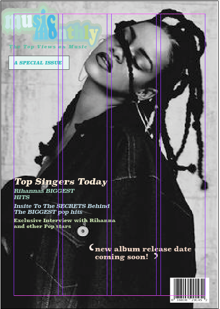
cover   double page spread updated cover www - i think i found a really good image and places the masthead in a very good spot ebi - maybe changed the colour on the masthead to make the colours pop more updated dps  www - i again think i found good music images  ebi - maybe made it a bit less plain

Magazine Design

Image
 Wednesday 29th June 2022 Learning Objective: To create an effective magazine cover & DPS using appropriate codes and conventions

Shot Composition

Image
 Wednesday 22nd June 2022 Learning Objective: To Explore composition and perspectives This is my favourite photo because of the positioning of the person and the space around them. Reflection Texture Extreme Close Up Angle Pattern

Introduction To Media Representations

 Wednesday 8th June 2022 Learning Objective: To Explore the Concept of Representation and Stereotypes The media offers the audience an interpretation of the world. Its a re-presentation of the events, people and places. Sterotypical - A Stereotype is a generalised representation of a person , place or time. They are limited and often offensive or used for comedy. Stereotyped Expectations Nurse -  Young , Female                                          Astronaut - Smart , Adventurous , Male         Nanny - Female                                                       Football Player - Male , Sporty , Rich  Teenager - rude , argumentative , hateful                Opera Fan - Loud , Rich   Teacher - Male , Strict , wears suits if male             Tattoo Lover - Male , Rock type of person Stereotypes can be challenged by some people but most people meet the standers of most students and teachers.  Stereotypes in Teachers in a school are normally represented as quite smart but as soon as the

InDesign

Image
Wednesday 25th May 2022  Learning Objective: To Explore and Understand how to use InDesign for magazine layouts

Magazine Cover Designs: Masthead

Image
 Wednesday 4th May 2022 Learning Objective: Explore the use of Adobe Illustrator to create a magazine masthead Film Magazine Covers Venom Film Magazine - Differences - Close Up Shot Type  Blue white and black Colour Palette Similarities -  Big Film Title with Bold Font The Main image is protruding over the Masthead Glass Film Magazine - Differences -  A bigger focus on the Main Image (3 People) Mid Shot Type  Red and White colour palette to stand out over the characters Similarities -  Big Film Title with Bold Font Characters protruding over the Masthead The Avengers Film Magazine -  Differences - A long shot of a crowd of people White ands Yellow Colour Palette The Main Text is the Masthead as the Film Title is small Similarities -  Characters still protruding over the Masthead Mask head -     Its small and simple so that when all the magazines are spread out and stacked you are able to recognise the brand of the magazine just from the red Q    Mask Head -    BillBoard is a very well

Magazine Front Covers

 Wednesday 27th April 2022 Learning Objective: To identify the features on a magazine front cover; to explore genre codes & conventions. Masthead - A Masthead is the big text at the top of a magazine telling u the maker/brand of the magazine. Dateline- A dateline is  it indicates the city the journalist was in when he or she reported on the story . It also indicates the date the story was filed. Main Image - The main picture that is the biggest picture on the cover. Cover Lines - A coverline is small text(s) on the front colour of the magazine telling u the contents of the magazine with small exciting sentences. Main Cover Line - A main coverline tells u the main focus of the magazine. Bar Code/Price - Tells u the price of the magazine via the bar code. Tagline/Strapline -   A strapline is  a subheading that is usually found at the top of a magazine, above the masthead - like a slogan. Pull quote - A pull quote is  Pull quotes are  short excerpts from the presented text . They are