Music Magazine
Wednesday 17th April 2023
music genres -
- rock
- hip hop
- pop
- metal
- drum and bass
- jazz
- blues
- k pop
- indie
- country
Research of 3 music genres:

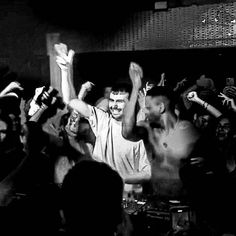
Women in rock often wearing bright and colourful outfits to match with the themes of their songs normally when performing them will normally have a backtrack playing with them just having a microphone to sing into.
When men are performing they will also often wear quite trendy stylish bring clothing to connote the impression that they have a lot of wealth same with woman as most of the songs are often about money or love/sex.
Rock - jddddddddddddddddddddddddddddddddddddddddd. Both genders normally dress quite alternatively and normally stick to black or dark palette of clothing choice and normally, not shown is this photo but will have long hair man or female so that they can shake their head as that is a big rock stereotype. Most songs just surround a lot of screaming and loud drums and instrumental like similarly metal music.
Drum and Bass -

Drum and Bass Research -
Drum and Bass plays on these radios:
- BassDrive
- Platinum Radio London
- AfterDark Radio
- Kool London
All of these radio stations are British because Drum and Bass is heavily based around the UK as most British teens and young adults listen to Drum and Bass as it is targeted to teens and young adults who go out partying at raves and concerts.
Moodboard for D&B


Monday 15th May 2023

Drum and Bass lyrics promote violence, drugs and sex which connotes that it promotes a young adult audiences as you have to be over 18 to do some of those things and music like drum and bass are usually played at gigs or motives which is where stuff like drugs and sex are promoted the most - at parties and stuff.
Music Magazines
Learning Objective:
To explore the terminology and genres of popular music magazines.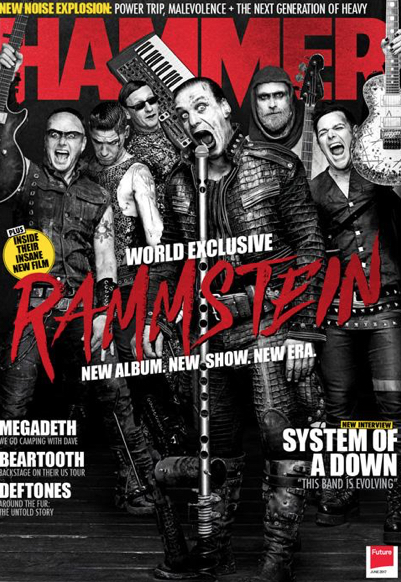
genre of magazine is metal - this is seen by the black and white colourless palette which is connoted to metal and rock same thing with their costumes, hair and makeup all connote metal and the lead singer can be seen screaming into the mic which connotes he is doing a metal song because metal consists of a
lot of screaming. The font and masthead is very bold and the only colour in the magazine which connotes that the band is intense and loud which portrays a metal aspect. The red may represent violence and pain.

lot of screaming. The font and masthead is very bold and the only colour in the magazine which connotes that the band is intense and loud which portrays a metal aspect. The red may represent violence and pain.
What is typography? Typography is the art of arranging letters and text in a way that makes the copy legible, clear, and visually appealing to the reader.
In graphic design, page layout is the arrangement of visual elements on a page. It generally involves organisational principles of composition to achieve specific communication objectives.
Lexis -the totality of vocabulary items in a language, including all forms having lexical meaning or grammatical function.
Colour Palette -


The typography in the masthead is one of the only colourful items in the magazine for the cause of it to pop out and the colour palette being red symbolises violence, anger, blood which all connotate back to the metal genre. The mise-en-scene show that they are of the metal genre by the spiky clothing, dark makeup and musical props which are all very loud and non-mellow instruments.
The layout of the main image is protruding over the masthead to make their faces and the main image to pop out and be more bold to the viewers. Lexis is shown when the repetition of the word 'new' which alerts the viewers to go see the new content.
Monday 5th June 2023

The mastheads are quite loud and bold at the tops of the screen and the main image of the celebrity usually comes with a bold cover line of their name.
 The colour palette and mise-en-scene of the main image of the focal point which is the person are surrounded with dark and gloomy colours. The typography are bold with a font type of capital letters connoting the loud music and overall 'vibe'.
 Hip-Hop magazines have a colour theme of sticking to 2 main colours in the magazine, colours which are usually quite opposite, for instance, white and black, light and dark to make the typography and the masthead on the magazine more bold and it draws the viewer in. Shot types are close up on almost all of them because in hip-hop magazines mise-en-scene in costumes dont matter more of their face is recognisable.
Monday 19th June 2023

This appeals to the audience because...
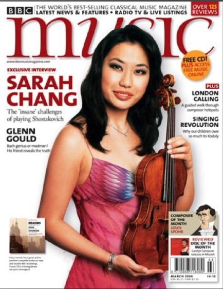
- The masthead font is a very classic, sophisticated font showing the audience maybe quite smart.
- The colour palette is very soft, relaxing colours
- The main prop in the main cover image connotes the magazine is to do with classical music
- The person in the main cover image is quite young person which targets younger audiences as a relation similarity.
- The mise-en-scene with her outfit and makeup fits in with the colour palette with a neutral outfit and natural makeup.
Mojo Audience
Learning Objective:
To explore and define the magazine's target audience.
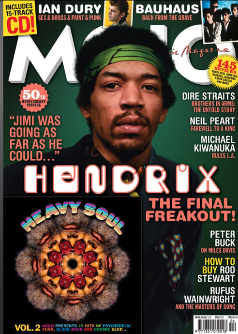
The genre for mojo is classic and modern rock
The publisher for mojo is Baeur Media Group
The target audience for mojo is a mature audience.
Circulation Analysis for mojo is 52294 print copies and 10439 digital copies per issue
The most successful magazine in a very dominating, competitive from online media is luxury brands which offer their audiences a glamorous world of glossy magazines.
These magazines take control of print media with high quality photography and media language. These statistics attract high status brands which add on to the luxury feel of the magazine.
Mojo magazine has aspects of this quality only for much cheaper with their paper types but it has enough publicity to pay for print produces that aren't free.
some examples...


Mojo covers current musicians and established musicians.
Every month, Mojo brings you an iconic act on the front cover, a CD, famous review section, 30+ pages of he best music that month.
Them and their readers are extremely passionate music consumers and 'obsessed'.
weekly magazine - lower class
monthly magazine - middle class
Niche - small / specific audience
Mojo is different from most magazines
- They access music through youtube, Spotify or amazon music.
- Hobbies and interests are festivals and music as well as collecting cd's and vinyls
- Type of jobs and family life are professional with high disposable income, daughter loves music
- Personality is music, it defines him.
- Relationship with music it has been with him his whole life and he collects them.
- They like mojo because he can keep and listen to their music without fear of it disappearing.

Representation and Target Audience
Learning Objective:


Monday 11th September 2023
Image 1

Image 2
The font type is script which connotes class and culture to the reader and shows their eduction through the instrument in the main image is a very expensive and posh music to play as it is apart of the string music group and is mostly presented in choirs. The language used in the magazine are very sophisticated words which also presents how the audience are cultured and educated.
Mojo U&G
Active audience -
A audience of people who read magazines are an active audience because you can choose what magazine to buy through genres ad covers and as well choose which section to read , how slow or fast you read it , you can re - read a magazine you have to turn pages to read a magazine and engage yourself into the magazine to understand the contents of it which all stand for ways of a magazine audience is active.
Uses and Gratifications
Personal Identity
Information
Entertainment
Social Interaction
Personal Identity

Madonna can come as a role model to fans through her quick success and her current success at her age which show strong determination and strength in the media world. She has been seen standing up for woman's rights which may be found recognisable with feminists and other supporters. She shows rebellion through her licking a cross in a mocking way which connotes her personal identity as straying away from religion and stereotypical groups which may reinforce other readers values and find common interests and identities with the artist.
Information

This context page shows everything that will be featured in the current magazine your reading it is shown as almost a trailer / sneak peek into the full magazine , it will show your current news happening , important issues in the world along with some sort of self care and news in music but that will all depend on what magazine the audience is reading.
Entertainment
The free cd inside the magazine is a form of entertainment through hearing the featured artists music which may let the audience understand the artist more as an artist. The magazine can feature gossip into other popular celebrities lives which can cause an escape for regular everyday life to get a sneak peek into celebrities lives. The visuals portrayed on the cover intrigues the viewers and entertains them to see more into the celebrities and audiences buy the magazines to get never heard of information before to entertain them which can also lead to social interaction with many audiences talking about the information / gossip featured in the magazine.
Social Interaction

The ' regulars' subheading can substitute as a real life interaction as audiences can find familiarity through the topics being discussed and as well as gossip being featured in the magazine can be discussed with friends and family as thing some celebrities do can be considered ' scandalous' and may cause come controversy not just in real life but online as well as people may be posting and commenting about certain situations which may also be tied in with entertainment as the main reason people gossip so much is because it is entertaining through social interaction.
Monday 2nd October 2023
What is media language?
Media Language is mise en scene and other techniques to describe visuals of what is being portrayed.
What is industry?
Industry is a company / media business.
What is audience?
Audience is the target for our work and we use representations to draw in the correct audience.
What is representations?
Representation is the stereotypes of different groups of people which define them.
What is context?
Context is background exposition on the subject of the context.
Representation of Teenage Dirtbag
- Stereotypical american high school
- Main girl is popular from regular non revealing clothing
- Jocks being represented wearing letterman jackets
- Protagonist is wearing non trendy clothes representing he is a loner
- A lot of first person point of view shots to put us in his shoes and see how small he feels
- Main girl has slow mo shots and close ups which represents her importance to the protagonist
Representation of Skater Boi
- Protagonist is rebellious through her mise en scene not being stereotypical , illegal gig
- She is shown being respected by others with the low angle shots of her singing
- Teens are wreck less through the destruction to private property, tattoos , piercings , violent behaviour
- Editing is fast paced and the camera is hand held which emphasises realism and portrays them as wreck less.

Music videos create representations that differ from others, this can be seen firstly in Teenage Dirtbag through the representation of women. The main female interest in the music video highly looked upon by the protagonist who is a male. as we are seeing her from his pov she is represented as stereotypical. This is admittedly seen from mise-en-scene of her character. She had light makeup on, hair tied up which gave her a clean and organised persona and ordinary 'trendy' clothing to connote her status at her school which was high up. The slow-mo camera shots and close ups of her appearance with the camera staying steady represents that now we are seeing her as he sees her putting her in a more feminine and angelic light.
However, in Skater Boi the main female character is represented in a much different point of view to the audience. She is made subject to the music video within the first 5 seconds with the medium long shot of her while she is addressing the camera directly which represents she is bold and does not conform to the natural female stereotypes. The low camera angles of her represents that she is respected by others and as well her mise-en-scene very much differs from regular feminine clothing, from her dark colour palette and her piercings and makeup.
Monday 9th October 2023
Learning Objective:
To explore the exam style question and practice exam techniques for Q4 focusing on media language and representations
Analyse the representations of musicians in the extract from Mojo Magazine

- colour - black and white - represents an old fashioned feel to the magazine - add a tone of seriousness and maturity
- camera angle - close up - see their facial expressions
- Lexis - words 'arise' 'dark knight' 'sos' - alliteration - represents that the person focussed in the magazine is an depressive element , connotes to a troubled past - surviving
The representations portrayed in the mojo magazine cover shows a depressed musician that struggles with his troubled past. This is firstly connoted with the lexis in the magazine , words like 'dark knight' 'surviving' and 'arise' , 'sos' these all have a semantic field of being reborn and coming out of a darker area of your past which is heavily connoted towards the musician represented in the magazine. Furthermore, more elements are used to support my statement, such as , the colour palette being individually black and white which portrays a depressive feel to the magazine due to the lack of vibrancy and colour in the magazine. As well as, the black and white colours shown may also being linked to a more olden day feel of the magazine which may connote to add to a tone of maturity and seriousness of the magazine. To conclude, the main image of the musician is shown as a close up camera angle to see their stern and serious facial expression in more detail which adds to the depressive representations of the magazine.
Analyse the representations of age or gender from Mojo Magazine

- Age - olde age - looks serious and sombre
- colour - black and white - olden day - old person represent
- Looking at us to show an intimidating look- low angle shows power
- Font used is connoted to be olden day / fancy and artists shown on the front cover are old artists which shows this magazine is targeted towards a younger audience
The cover of Mojo Magazine shows the age is represented through the use of various media techniques lie colour palette, font type and other elements. The first thing that was suggested to me as an more old look is the colour palette which was black and white. This represents a more old fashioned feel to the magazine due to old films and photos were always shot in black and white. To continue, the mise-en-scene shown on the main focus of the magazine is a suit which is formal wear which connotes to a more traditional olden day look furthermore emphasising my original statement. The low camera angle portrays the man looking down on the viewers which represents a look of power and intimidation as is is also staring at us purposefully. The font shown on the magazine through the cover lines are more connoted towards a old time through the fancy lettering as well as the artists promoted in the cover lines are all old artists therefore implying that their target audience is an older audience.
Monday 30th October 2023
What is shot type?
Shot type is different shots of a camera
What is typeface?
Different fonts
What is colour palette?
All colours presented on the analysis is a colour palette.
What is a Lexis?
The words that are used in a cover line
What is a masthead?
The title of a magazine.
Music Industry
Is the media language different because of the genre?
Yes the media language is different because of the different genre conventions.

Codes and conventions -
Genre conventions are elements, themes, topics, tropes, characters, situations, and plot beats that are common in specific genres.
Codes are systems of signs, which create meaning. Codes can be divided into two categories – technical and symbolic.
Intertextuality -
Intertextuality happens when the conventions of one genre are alluded to in another, or when a specific cultural reference is made in a media text.
Layout -
Layout is the arrangement of visual elements on a page.
Typography -
Typography, the design, or selection, of letter forms to be organised into words and sentences to be disposed in blocks of type as printing upon a page.
Colour Palette -
A colour palette, in the digital world, refers to the full range of colours that can be displayed on a device screen or other interface, or in some cases, a collection of colours and tools for use in paint and illustration programs.
Images -
in media, images are defined as a visual representation of something.
Lexis -
The specific language and vocabulary used to engage the audience.
Connotations -
an idea or feeling which a word invokes for a person in addition to its literal or primary meaning
Magazine No.1 -
Is the layout cluttered or ordered?
Cluttered.
What does the choice of the layout connote?
The connotations of the layout is portrayed as targeted for kids as the layout is very cramped and in your face almost being perceived as 'eye candy'.
Is the colour palette muted or saturated?
Saturated.
What does the choice of the colour connote?
The connotations towards the colour palette suggest that it is targeted towards children/ earlt teens, partially females. This is connoted through the stereotypical term that is girls like pink and a female image is surrounded with pink, feminine colours which is portrayed in this magazine.
Magazine No.2 -
Is the layout cluttered or ordered?
Ordered.
What does the choice of the layout connote?
The connotations of the layout suggest that the target audience is more matured as the layout is very organised and ordered which to other audiences could be portrayed as 'boring'.
Is the colour palette muted or saturated?
Muted.
What does the choice of the colour connote?
The colour palette is very plain with no saturated colour and being close to a black and white palette but is not, the background of the main image (excluding the model presented) is blurred which portrays the magazine only wants to focus on the music aspect with the plain colour palette.
Magazine No.3
Is the text mainly serif or sans serif fonts?
Sans serif.
What does the font choice connote?
The sans serif font is portrayed as more bold and catches your eye better than using a regular serif font which connotes that the magazine is more loud and in your face.
The font style of the main cover line is the same font as the rest of them but is scaled up to a much higher degree which connotes the importance of that line as-well as clearly stating its the main cover line.
What does the choice of font and colour connote?
The colour palette is red and white mainly which connotes a slight form of class and presents the idea this is going to be a more intellectual magazine than maybe other they have done but this does juxtapose slightly with the font as the font is bold which presents the. idea of the magazine being loud.
Magazine No.4
Is the text mainly serif or sans serif font?
Sans- serif.
What does the choice of the font connote?
The font is very bold and wide which does connote the hip- hop element to the magazine as well as presenting the aspect of being sort of in your face and connoting an area of bravery.
The font style of the main cover line is connoted as being popular in the early 2000s which connotes this magazine will surround the idea of rappers from the early 2000s which justifies the idea of it being a hip-hop magazine as that was very popular in the early 2000s.
What does the choice of font and colour connote?
As been said, the font fully indicates the hip - hop aspect of the magazine however the colour palette, more specifically on the main cover image is in black and white which connotes a feeling of seriousness and with the background have no colour the cover lines can almost pop out the page with the bold font types and the saturated colours.
Magazine No.5
What type of shot is the main image?
Long shot.
Why was this shot type used? What is it showing?
Firstly, by using a long shot is it showing in full detail the mise-en-scene of the characters in the main cover image, it can be seen they are wearing all black which i would assume was chosen to firstly, clash with the white background behind them and also make the white cover lines more bold and visible.
Does the text use an informal or formal register?
Informal Register.
What does the choice of register connote?
The register connotes the artist featured in the magazine are more laid back and use slang and informal language to relate more to their audience and target their audience more.
Magazine No.6
What type of shot is the main image?
Mid shot / close up?
Why was this shot type used? What is it showing?
This shot type was used to obviously show the main focus of the magazine, the artist but as well show the mise-en-scene which connote the artist to be quite wealthy through his jewellery as well as his clean white suit.
Does the text use an informal or formal register?
Informal register.
What does the choice of the register connote?
It connotes the personality of the rapper shown and the overall feel of the magazine as the magazine will be surrounded around the main cover image focus.
Monday 6th November 2023
Babyboomer generation - a person born in the following years of world war 2 (1940-50)
Diversification - the process of varying products
Audience address - how the text influences the audience
Discerning - showing good judgement
House Style - a company's preferred layout and presentation
Learning Objective:
To explore the exam style questions and practice exam techniques for Q5 focusing on media language and representation
Context:
- gender roles
- attitudes to sexuality
- multiculturalism
- celebrity culture
- consumerism

Shot Type - Medium Long Shot
Star Vehicle - David Bowie
Colour Palette - Pastel pink, purple, blue - feminine colours / saturated
Bands/ Artists mentioned - The Byrds, The Beatles, Fleetwood Mac etc. 7 artists mentioned + bowie
Masthead Style - Uppercase , Sans serif , drop shadow , bold ,
Main cover line style - Uppercase , sans serif , bold, different colours
Minor cover line style - Uppercase, sans serif , bold , black and white
Puff - Uppercase, colour , serif
USP - Free CD , pink and white , same as the puff
Placement of text - layout fits the placement of text and the genre codes and conventions
The shot type of the main cover image is a medium long shot. This is done for many reasons, firstly to show off the mise-en-scene of the artist conveyed in the magazine. His outfit correlates to the colour palette of the cover mainly through the bright blue exaggerated as the rest of this suit is grey which is associated with the blue shown on the cd cover. Mojo as well has a recurring motif of the star vehicle covering the masthead of the magazine but not too much to make it recognisable , this is done to portray and draw attention to the artists face so its straight away the first thing the readers will look at.

The shot type compared to the mojo magazine is different as the shot type portrayed in the wire magazine is an establishing long shot. This is to not just show the model and the mise-en-scene on the model like in the mojo magazine but to differently, show the background and the mise-en-scene going on in the background of this main cover image. The mise-en-scene in this magazine is similar to the mojo magazine in thee element of clothing , they are both wearing suits but the aspect that is portrayed differently is the mise-en-scene shown in this shot type as the colours as dull and not saturated like mojo magazine . This connotes that this magazine has a more mature and serious aspect to it as well as the background blending in with the pattern of the colours being dull . The shot type in the mojo magazine is just of the artist which connotes the magazine will surround the idea of the artist whether as the shot type in this shows way more material which connotes that the magazine may be about cars or a more serious topic and not just focussed on the model portrayed in the magazine.
Monday 13th November 2023
1. Radio 1 is owned by BBC.
2. The BBC is funded by TV license.
3. The radio is regulated by Ofcom.
4. PSB radio is public service broadcasting which is for the benefit of the public.
5. The 2 types of radio are commercial and public service broadcasting , commercial features adverts.
Learning Objectives:
To research the case study.
Annotate in detail the examples from the case study.
Songs, original and cover
Beyonces - cuff it, mentioned and then performed
Olivia Deans original song - Dive
Worked with Rudimental before but is her first solo on the show
Covering Beyonce means she is a really good singer and is very confident in herself.
Guest info
Olivia Dean - 24 years old
24th October at Live Lounge
Big fan of Beyonce
Quotes from the show to remember
' you are a liar, you are not nervous!'
'man'
'not my first rodeo'
'collab'
'your a joke Olivia'
- Informal dialog and slang to relate to the target audience.
Appeal to the TA
'smashes that to bits' - slang
Artist is in the same age for the target audience
Beyonce brings in more audience as she is a mainstream artist.
Putting an informal tone on the radio makes the target audience feel involved in the converstaion and connotes it to be like a podcast.
Inform, entertain and educate?
Mentions of Beyonces fan group 'bee hive'
Applause for her performance , entertaining through live music
Live band with Olivia - 10 people including her
Does not swear on the show
Innovative & Cutting edge new UK music?
Olivia Dean - upcoming artists new songs promoted
UK music band played during the intermission - Jungle

1. 15-29 year olds
2. It appeals by using artists who are apart of the age range, using slang that, that generation will be familiar with / informal language - speaking like its a normal conversation as seen on podcasts which makes the listener feel apart of that conversation.
3. The audience being targeted are teenagers/ young adults who will be vaguely familiar with most artists and songs covered and performed.
4. Radio 1 appeals to the audience through having the presenters be very upbeat and happy as well as them being roughly within the age range of the target audience.
5. Commercial radio is different as it features adverts and advertisers.
6. Commercial radio audience is a mass audience
7. Commercial radio appeals to their audience by using different various and genres of music - no live music because they are only trying to make money.
The Live Lounge meets the Remit because they entertain and engage a broad range of young listeners along with speech and conversation between the songs and meets the target audience.
They offer a range of new music through upcoming artists in the UK and performs live music to entertain the viewers.
Interviews Olivia Dean - which comes under speech and entertainment as well as new information about the upcoming artist.
Monday 20th November 2023
Genre Codes - Symbolic tools used to suggest the genre in media material.
Intertextuality - Reference to another media text or material.
Typography - Fonts of texts, size of text, colour of text
Connotation - Deeper meaning with an object or material.
Lexis - Vocabulary and level of text
Contextual issues in magazines today? - Multiculturalism , Gender Roles, Technological Focus , Consumerism , Celebrities
Learning Objective:
To explore the exam style question for music magazine and Music videos

Shakira, female, revealing, direct audience, mid shot Colour Palette - gold, yellow - connotes respect, wealth and power
Masthead - sans serif , connotes modern and cleanliness. Lowercase, colloquial, relaxed and informal Layout is simplified - relaxed, informal - draws back to the masthead.

Analyse how media language is used differently in the two covers
Comparing the two magazine , it is present that media language is connotes differently through both to direct it towards their target audience. This is proven firstly through the colour palette - in the billboard magazine the colour palette is black, white and yellow which can be proven to be quite saturated colours but as well connotes a sense of class and wealth along with the mise-en-scene of the gold specks placed on the singer to connote she is wealthy and could also portray a look of sophistication through the hierarchy of class. Whether as , in Mojo magazine the colour palette is similarly saturated but - including the main image - it is mainly presented as quite cluttered and 'messy' in a sense as the colour palette doesn't quite stick to a certain area as in it doesn't have a pattern.
Another form of media language is the contextual issues presented in the magazines through mise-en-scene. In the first magazine , the singer presented in the main image is wearing very revealing to no clothes that can be seen to viewers which connotes a promiscuous side to the singer and brings along sex appeal to her which shows the gender equalities in our time currently through magazines as women are still presented as sexy through the lack of clothing , the makeup - anything that connotes them to be a sex object basically. However, in the mojo magazine the main image is based in the 60s and the mise-en-scene of their outfits are they are very covered up in suits and they don't really project any sex appeal to them as their outfits and makeup do not connote any of that because they are supposed to be presented as respectable. In conclusion, i think that the media language between the two magazines are very different through the colour palette and the connotations of the mise-en-scene on the star vehicles.
Teenage Dirtbag - Representations - popular people, geeks, highschool
Sk8ter Boi - Representations - Rebellion , shown as fun , a women leads the rebellion , respected , police , city setting , grafitti, abandoned building, urban
Media Language - Mise-en-scene, fast paced , narrative , lighting
NOV 23 PPE
Question 2
By choosing a younger presenter with a clear interest in music makes the topic feel more special as the presenter is so enthusiastic.
Question 3
Teenager Dirtbag Themes and Issues - Unrequited Love, Non popular representation , Positive - Youth and Romance, Negative - Rejection
Skater Boi Themes and Issues - rebellious teenagers, alternative cultures- Friendship
Question 4
Representation - how someone or something is presented.
- - social group
- - stereotype
- - views and messages
The age represented in the extracts are drastically different, in mojo magazine the main focus is represented as older to add a more mature feel to the magazine, along with mojo being around rock which was very popular around the time of thee main focuses youth. Furthermore, in gramophone, the main focus is represented as very young to appeal to the classical genre of the magazine giving the viewers a sense of calmness through her smooth, posh appearance.
Question 5
The media language used is very different which creates different messages.
- - body language
- - typography
- - main image
Question 8
- Build up promotion marketing
- More profit - cinemas make more money in the box office
- Film Awards - only nominated if in cinema first for release
Question 9
- Learn more about the characters featured in the film
- Released video game before film
- Numerous more characters to play than featured in the film
- Extends the life of the characters as the game is longer than the film
- More profit
Question 10
Trailer conventions :
- Time 2-3 mins
- Promotes movie
- Introduction to characters
- Voice Over
- Inter Titles - release dates etc.


17/4- Excellent work today.
ReplyDelete5/6- Great work on your analysis of genre codes. T: 1. Pick out key examples of media language to analyse and link to audience appeal.
ReplyDelete18/9- Excellent work onU&G you were absent from the lesson today, please read through and complete the work.
ReplyDelete10/10- Great analysis points T: 1- tie the ending back to the original question on age.
ReplyDelete20/11- Great analysis and detail provided for the covers T: 3. Another analysis paragraph needed for your response from the notes we made.
ReplyDelete