Magazine Cover Designs: Masthead
Wednesday 4th May 2022
Learning Objective:
Explore the use of Adobe Illustrator to create a magazine masthead
Film Magazine Covers

Differences -
Close Up Shot Type
Blue white and black Colour Palette
Similarities -
Big Film Title with Bold Font
The Main image is protruding over the Masthead
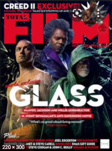 Glass Film Magazine -

Glass Film Magazine -Differences -
A bigger focus on the Main Image (3 People)
Mid Shot Type
Red and White colour palette to stand out over the characters
Similarities -
Big Film Title with Bold Font
Characters protruding over the Masthead
The Avengers Film Magazine -
Differences -
A long shot of a crowd of people
White ands Yellow Colour Palette
The Main Text is the Masthead as the Film Title is small
Similarities -
Characters still protruding over the Masthead
Mask head -
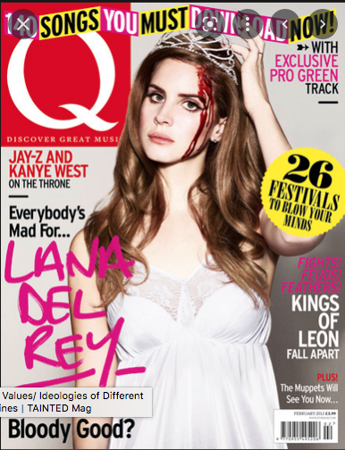
Its small and simple so that when all the magazines are spread out and stacked you are able to recognise the brand of the magazine just from the red Q

Mask Head -
BillBoard is a very well known magazine company and Katy Perrys head being infront of the Masthead symbolises her being associated with the brand.

Mast Head -
The Masthead here is a very bold and short Title making it stand out throughout the whole magazine.
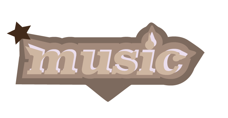
Masthead for my magazine - MusicMonthly

Wednesday 11th May
Learning Objective:
Explore the Use of Abode Illustrator to create a magazine masthead


Wednesday 18th May 2022
Learning Objective:
To Use Adobe Illustrator to create an effective magazine masthead.
The genre Im doing is music and the sub genre is pop
The Title of my magazine is MusicMonthly
The Conventions of most music mastheads pop out a lot and excentuate the masthead compared to the rest of the magazine and use bold colours.


Great notes. Did you only come up with one masthead idea?
ReplyDelete